
Out in the wild
A sprinkling of projects big and small.

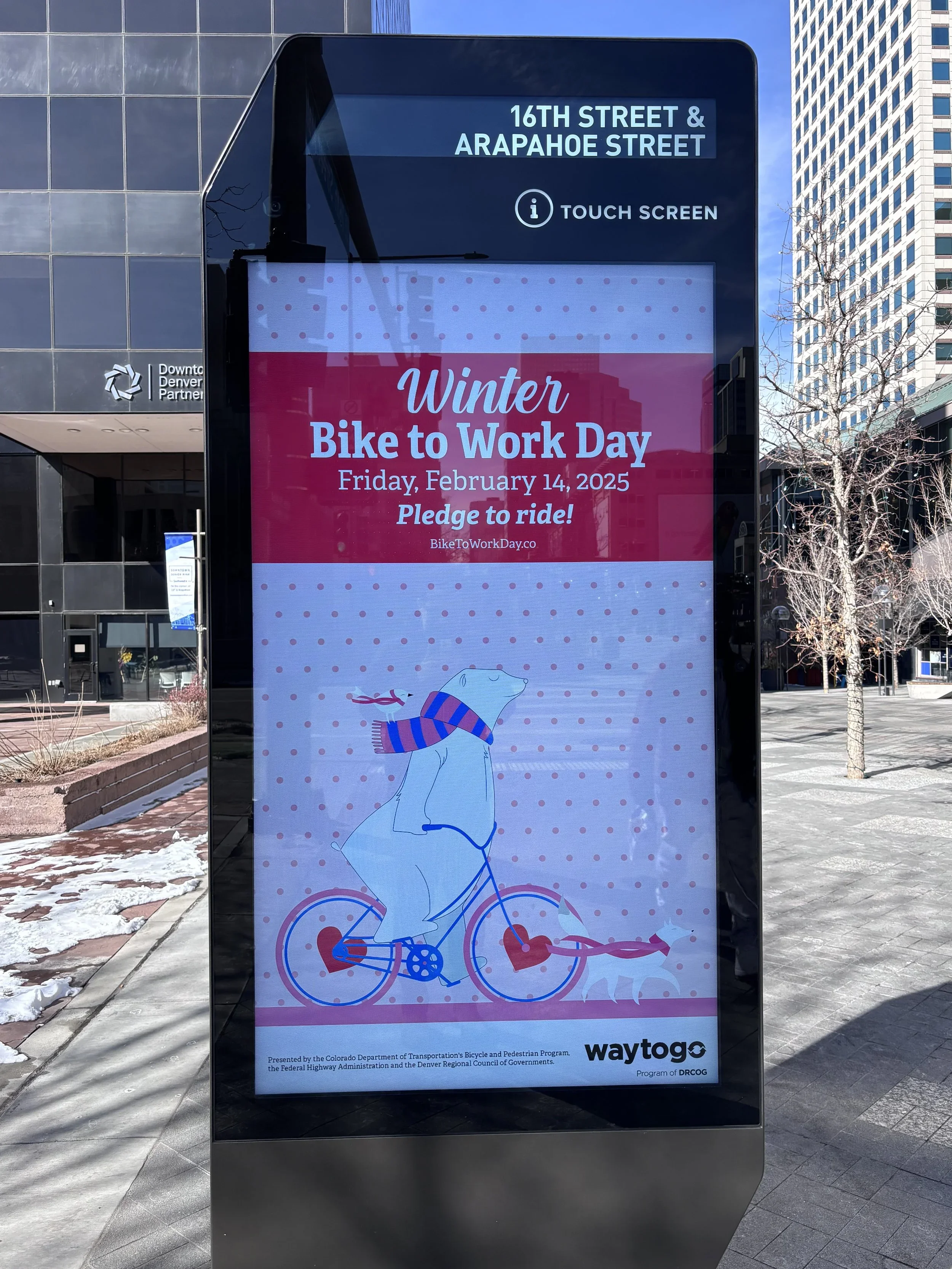
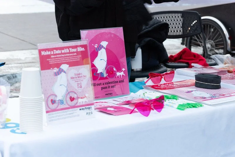
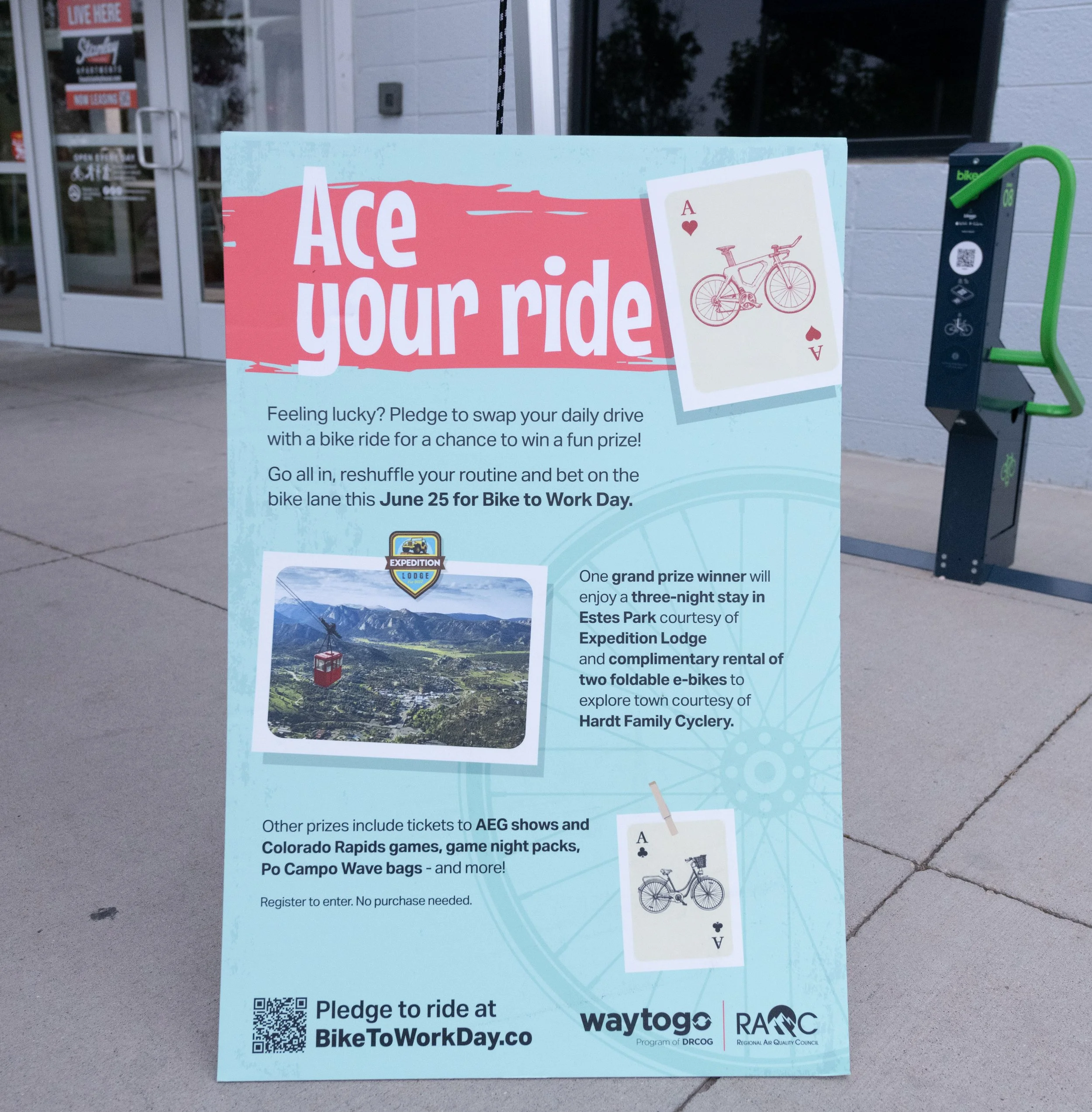
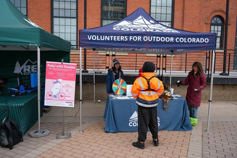
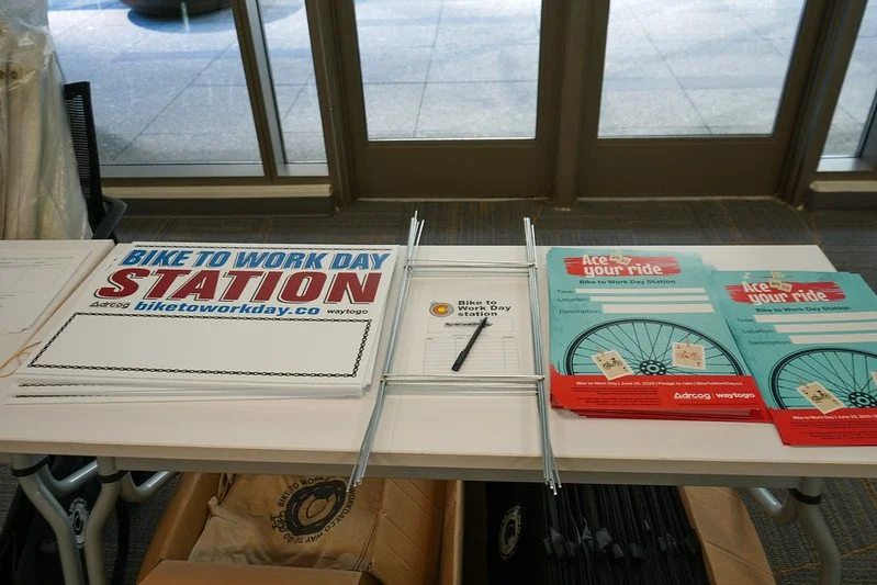
Bike to Work Day Regional Campaign
In 2025, I developed the creative for both the Summer and Winter Bike to Work Day campaigns, creating two distinct seasonal identities for one of the Denver metro area's largest active transportation initiatives.
Organized by Way to Go, Bike to Work Day reaches tens of thousands of participants through 200+ rider appreciation stations, community partnerships, employer toolkits, digital campaigns, public installations, and events across the Denver metro area. There’s even an after-party!
After our theme selection among the communications and marketing team, my designs were selected for both campaigns. I designed everything from end-to-end, spanning digital billboards, signage, maps, wayfinding, postcards, stickers, merchandise, social media graphics, interactive experiences, and more.
Role
Graphic Designer
Client
Way to Go, A program of DRCOG
Year
Winter & Summer 2025
The Work
Outdoor Pieces


Scope
Campaign Identity
Environmental Graphics
Print Design
Digital Design
Event Branding
Illustration
Wayfinding
Merch
Community Experiences


Around the Region
200 - Rider appreciation stations
Thousands - Annual participants
9 - Counties served
Hundreds - Employers and community partners
2 - Seasonal campaigns per year
Dozens - Unique deliverables


Printed Materials


Other projects
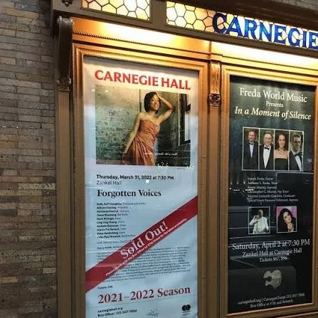
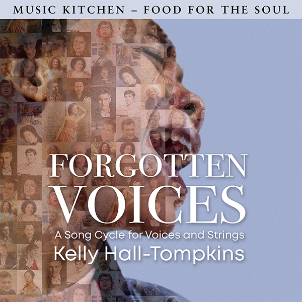
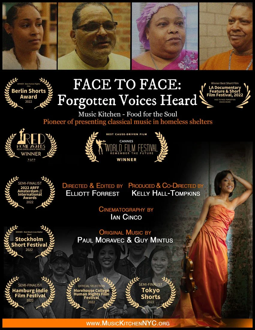
Kelly Hall-Tompkins
Community impact is very important to me, which is why working with Kelly Hall-Tompkins was such an honor. Kelly is an internationally acclaimed violinist and the founder of Music Kitchen – Food for the Soul, bringing live classical music to people experiencing homelessness. I had the privilege of designing for several projects of hers, including Forgotten Voices—a powerful live performance pairing music with stories from shelter clients. I created the poster displayed throughout NYC and Carnegie Hall, along with the cover for the Grammy-nominated album of the same performance. Kelly has continued to trust me with a variety of other creative projects, and I couldn't be more grateful.
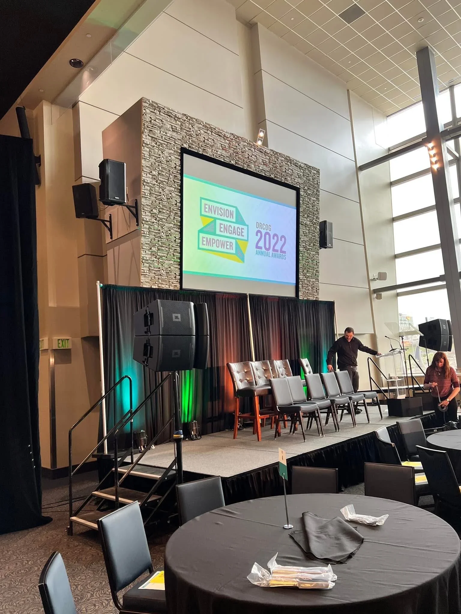
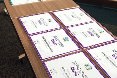
DRCOG 2022 Annual Awards
Celebrating the people making the Denver region a better place to live, work, and play, the 2022 DRCOG Awards Celebration was one of my favorite large-scale projects. I developed the event's complete visual identity, including the award plaque, printed program, digital award graphics, video templates, and the recipient videos shown throughout the ceremony. Every piece coming together into one cohesive experience and showcased at Empower Field at Mile High Stadium was a great (if a little high pressure) experience.

Miscellaneous projects
I’ve created various one-off projects of different sizes for different organizations.
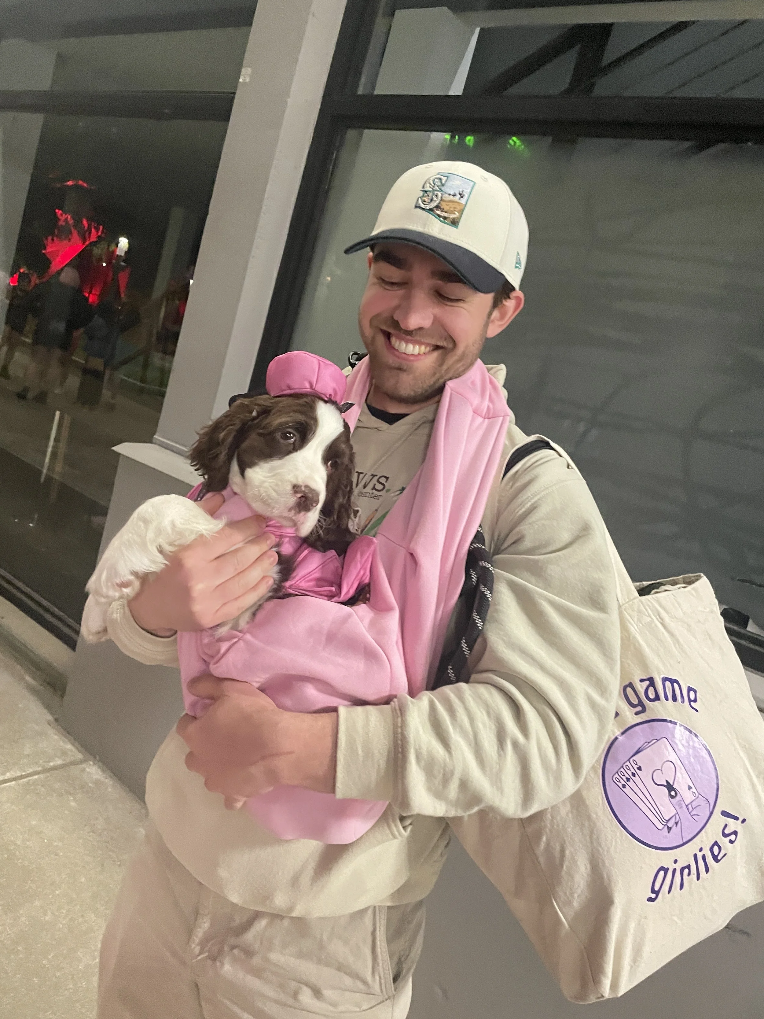
board game girlies!
board game girlies! is a social club based out of Seattle that also focuses on teaching women and femmes board games of all types (including TTRPG games).
For Photography Projects, Illustrations, and Magazine Covers, visit here.
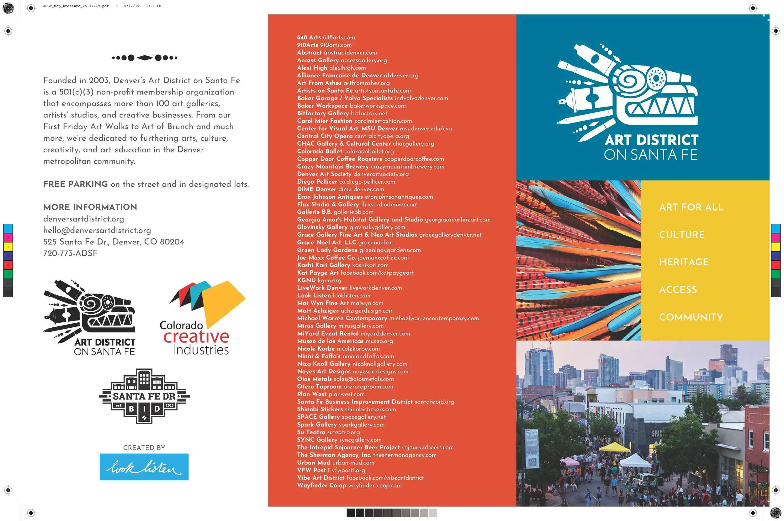
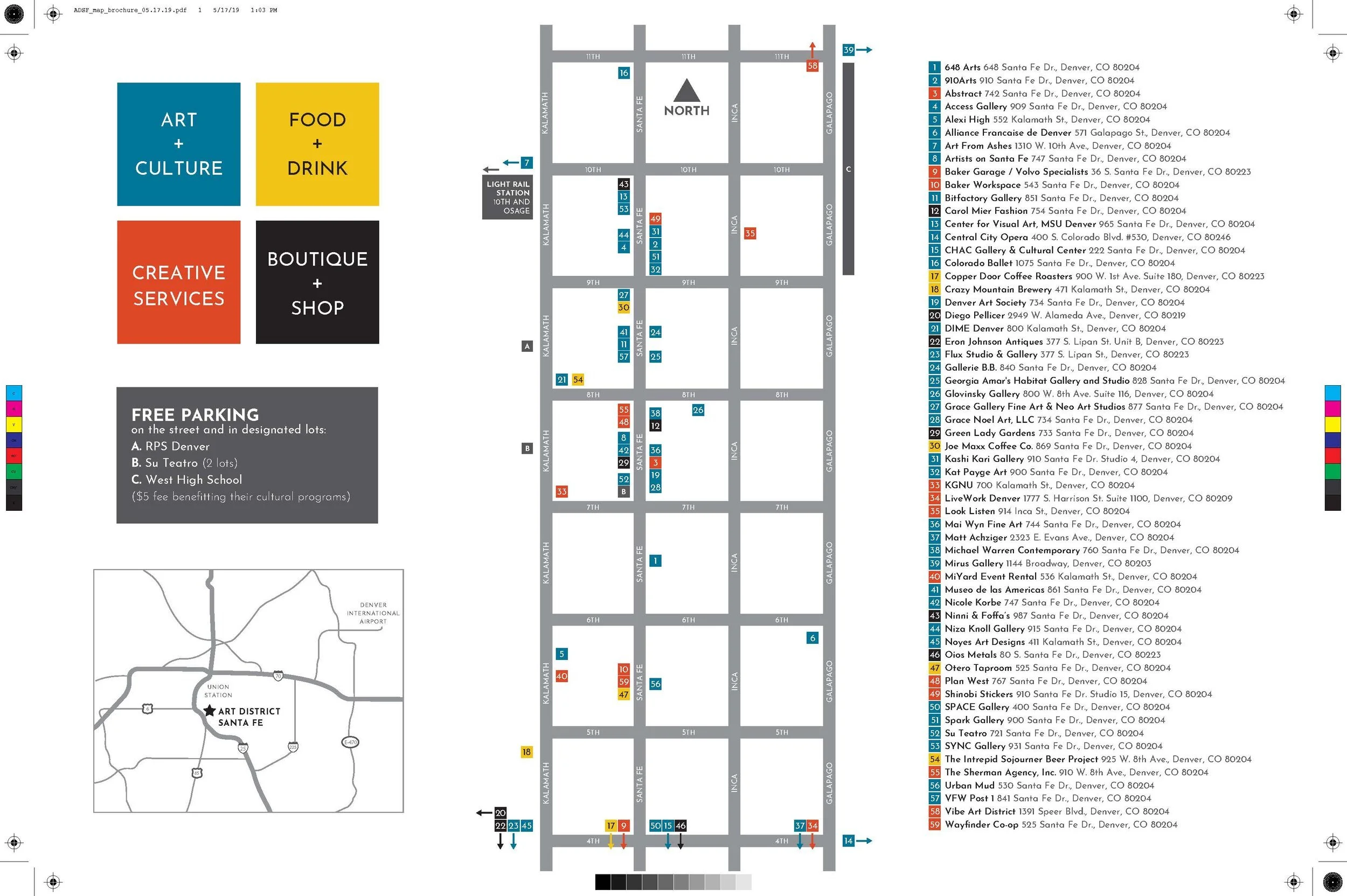
ADSF
The Art District on Santa Fe is one of Denver's most fun and vibrant creative communities, bringing together hundreds of artists, galleries, studios, and local businesses. Events all year long, including the popular First Friday Art Walk, it celebrates everything that supports one of the creative hearts of Denver. I was lucky enough to be part of the team that created the district's visual identity, helping design the logo, maps, brochures, and street pole banners that brought the brand to life throughout the neighborhood.

ANB Bank Digital Sign
This was a sign created for Ardent Grove Foundation to be displayed on an ANB Bank digital display.